PROTO DAILY · SELF-INITIATED CONCEPT
A tech-news app that tunes itself in the open, as a clickable prototype.
THE PREMISE
News apps hide why a story appears, and readers cannot steer their stream.
WHAT I DID
- Drew the mark, set the masthead and type
- Designed every surface on one token set
- Prototyped the flows between them
- CLIENT
- Self-initiated · no client
- ROLE
- Design + prototype, solo
- YEAR
- 2026
- STACK
- Paper · clickable prototype
Show the reader why a story appears
- Every story in For You carries the reason it reached you, adjustable in place.
- The controls sit beside the story, so tuning happens where the reading happens.
- A working ranking engine was out of scope. The prototype tests the interaction and the identity.
Split the feed into three surfaces
- For You holds the stream. Discover makes following a field deliberate. Reader carries the long read.
- Onboarding asks which fields to follow, so the first edition starts from a stated choice.
- Serif type reads, a compact sans carries the controls, and mono marks figures and weights.
Take the geometry of 1980s Memphis
- The brand draws on 1980s Memphis design: bold primitive shapes, squiggles and dots used as objects.
- The PD mark is built from those primitives, two bars and two circles.
- Corporate Memphis, the flat cartoon people of tech marketing, stays out. The figures carry the shapes: arcs, sine waves and nodes.
- Memphis color is loud. Here one lime accent on bone keeps the page calm enough to read.
What it proves, and what it does not
- One token set carried three surfaces with no second design pass.
- A concept has no readers, so there is no adoption or engagement number to report.
- The open question is whether an explanation makes a reader trust the feed or ignore it.
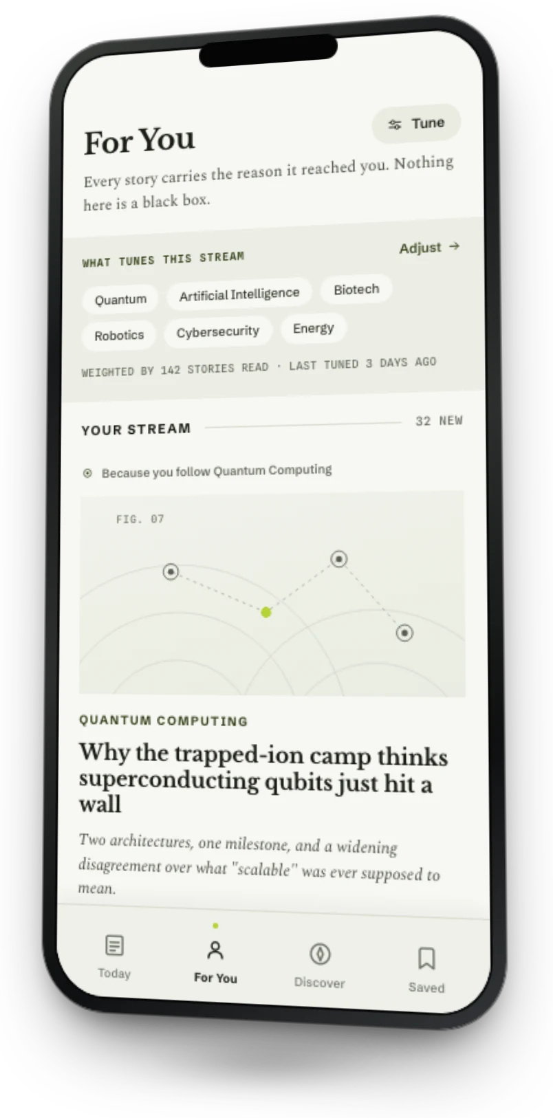
THE PROTOTYPE — the reason it reached you.
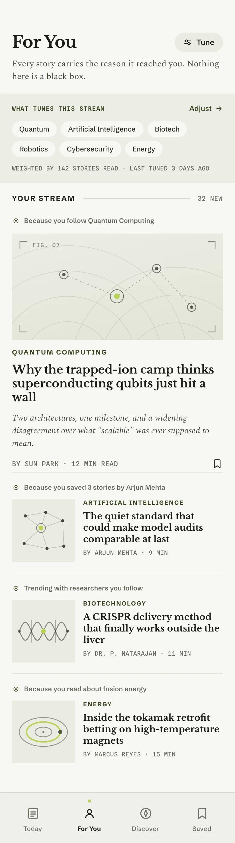
DRAWN IN PAPER
- LEARNED
- Skimming, following a field and reading long are forced into one feed.
- DECIDED
- Three surfaces: For You for the stream, Discover for fields, Reader for the long read.
DESIGNED · IN PAPER◁ DRAG ▷PROTOTYPED · IN REACT, FOR THIS SITE
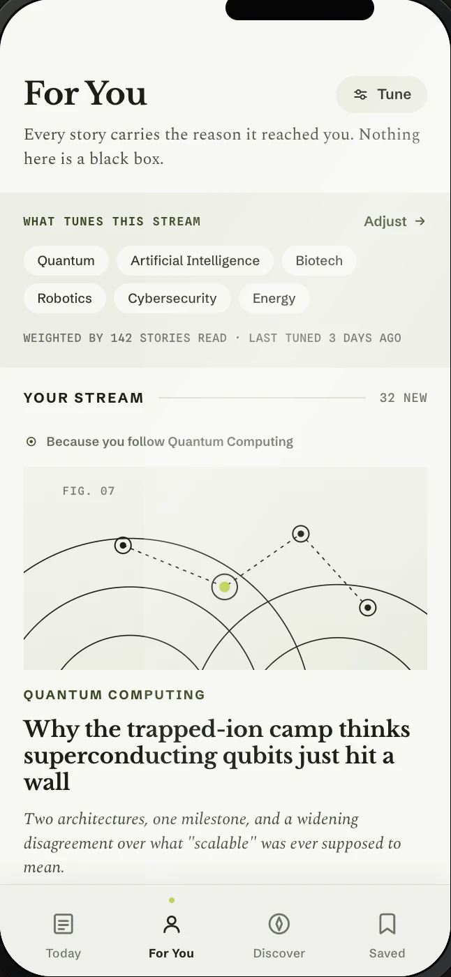
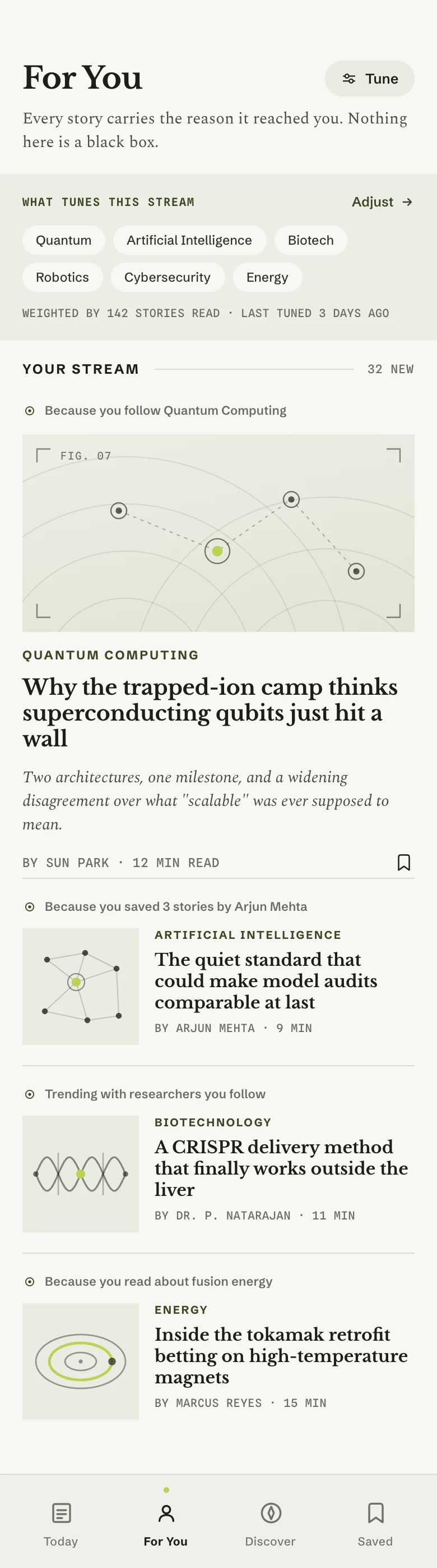
DESIGNED · PROTOTYPED — drag.
THE SYSTEM, LIVE — three pieces of the prototype.

READER — serif reading view, figure plates, and type controls.
TODAY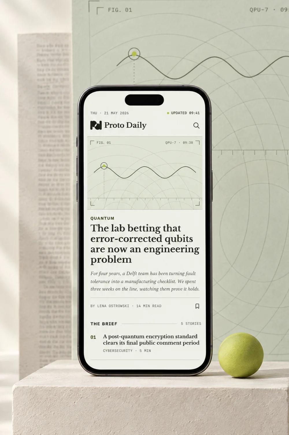
DISCOVER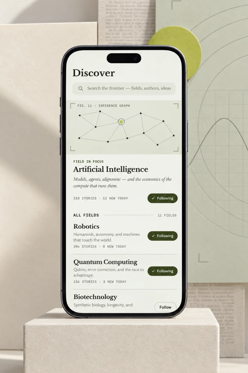
SAVED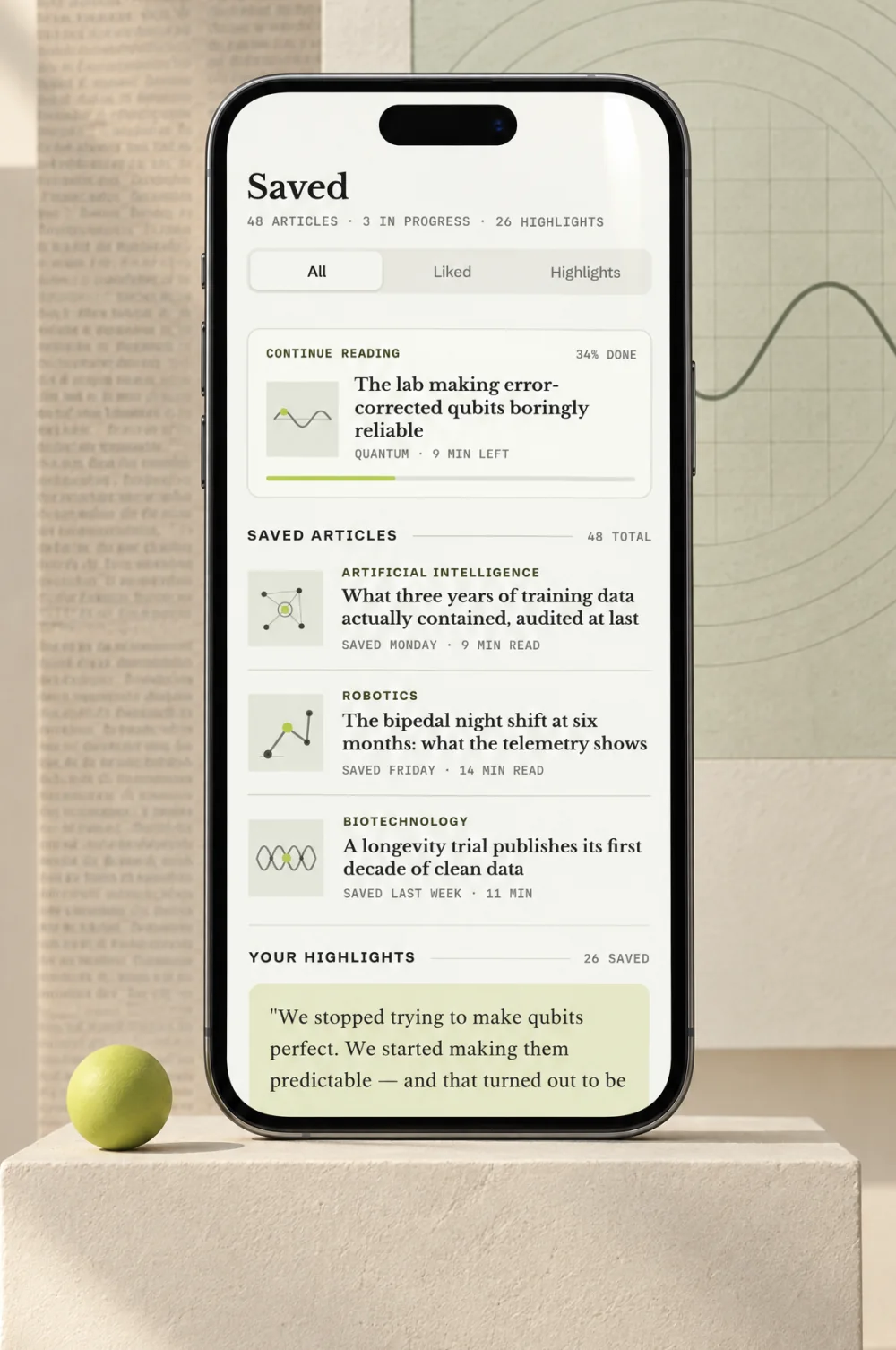
TODAY · DISCOVER · SAVED
SPLASH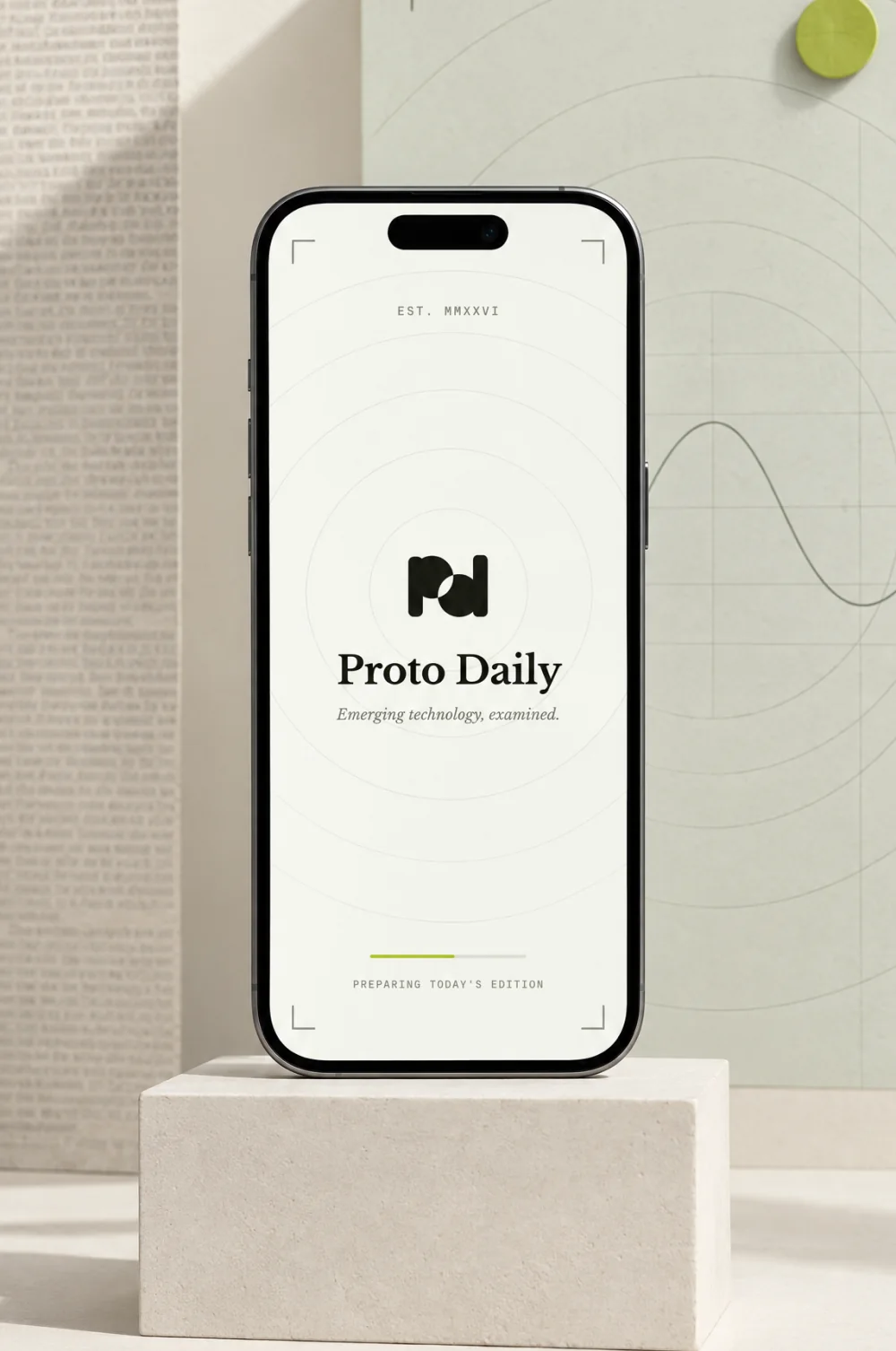
YOUR FIELDS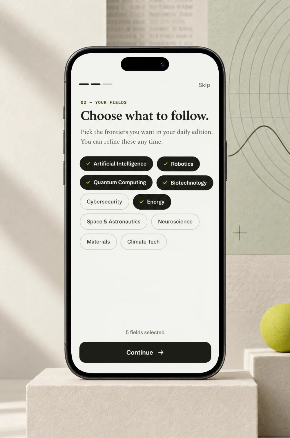
YOUR RHYTHM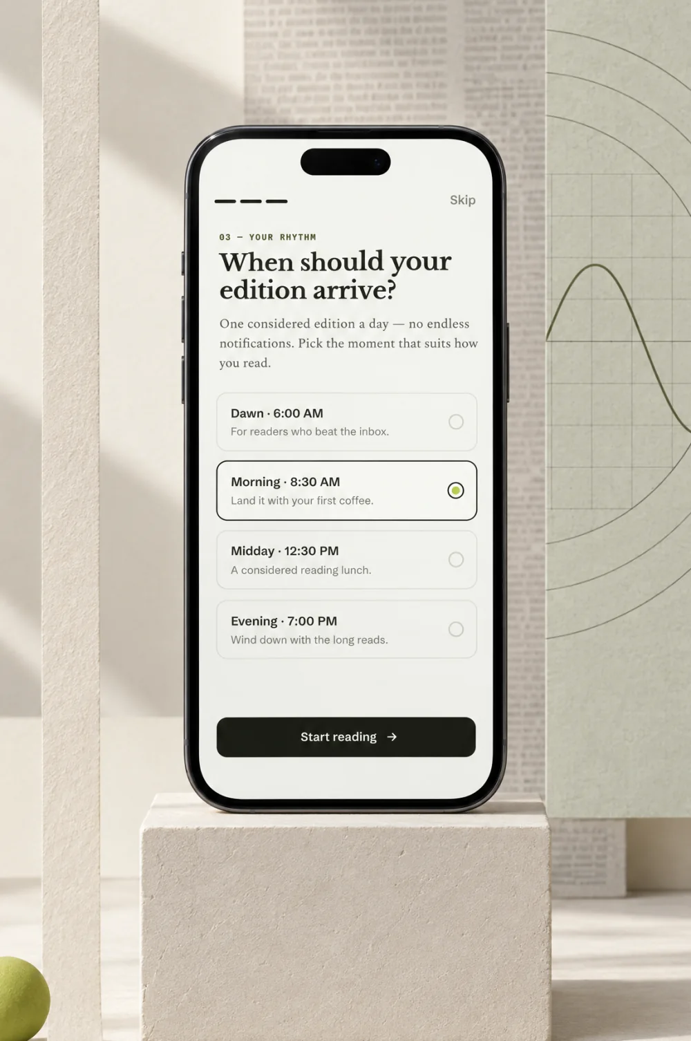
SPLASH · YOUR FIELDS · YOUR RHYTHM
- Tokens first, then screens. Showing the why of the feed, in the feed, is the product’s edge.
- Validate the tuning model with reader testing: are the explanations useful, do the controls make sense.
NEXT PROJECT
Matt Kenney’s Design Co.
Ten teeth = ten letters: the skull-key mark juried into LogoLounge Book 15